When it comes to choosing a colour combination for your living room it’s important to think about what type of space you want to create and its purpose. Do you want the space to appear larger or perhaps you want it to feel more welcoming and homely? By creating your own mood board or gathering design examples for inspiration, you should be able to find consistent themes that you like and want to recreate. These goals can be achieved through careful colour scheme planning, read on to find out how you can apply these helpful tips in your home.
The simple colour scheme rule
A very easy design rule to follow when choosing an interior design colour palette is the 60 – 30 – 10 rule.
- 60% of the room should be the dominant colour.
- 30% the secondary colour.
- 10% should be an accent.
For example, the 60% colour should make up a large portion of the space such as the walls or sofa and will generally be a more neutral colour, the 30% supports the dominant colour which could be curtains or furniture and can be bolder in colour. Lastly the 10% remaining is for accentuating the two other colours and will generally be the boldest colour which can be displayed as artwork or decorative accessories. This doesn’t restrict the shade variations that can be used in this modern colour palette and in doing so will create an overall complimentary aesthetic. This is a guideline and if you are feeling confident you can add in another colour and change the formula to 60 – 20 – 10 -10 or even more if you wish to do so.
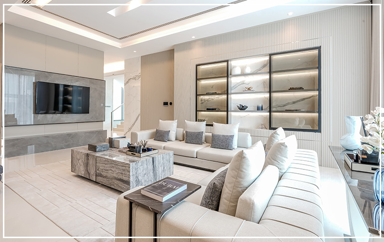
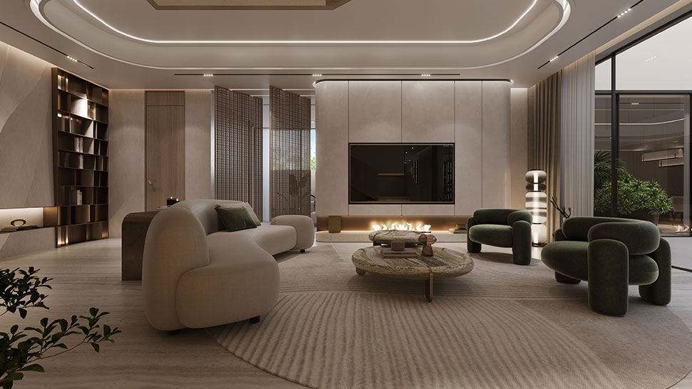
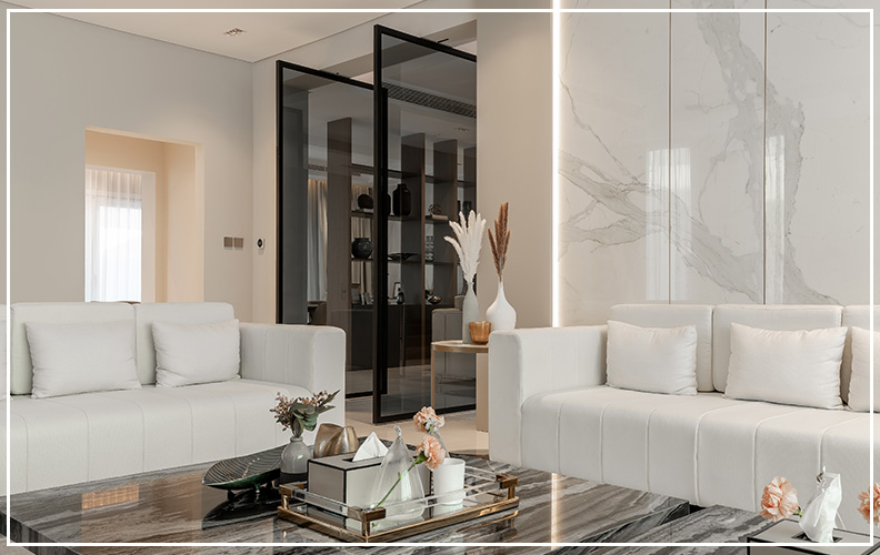
As you can see from the image, by having a wall colour combination for a living room and using taupe on the walls paired with a white ceiling, it gives dimension to the room and accentuates the high ceilings. This room colour combo adds a sense of sophistication and creates an elegant space. By adding in a dark grey coffee table, textured cushions and shelving, it highlights the contemporary features and compliments this attractive two colour combination design.
Choosing the right undertones
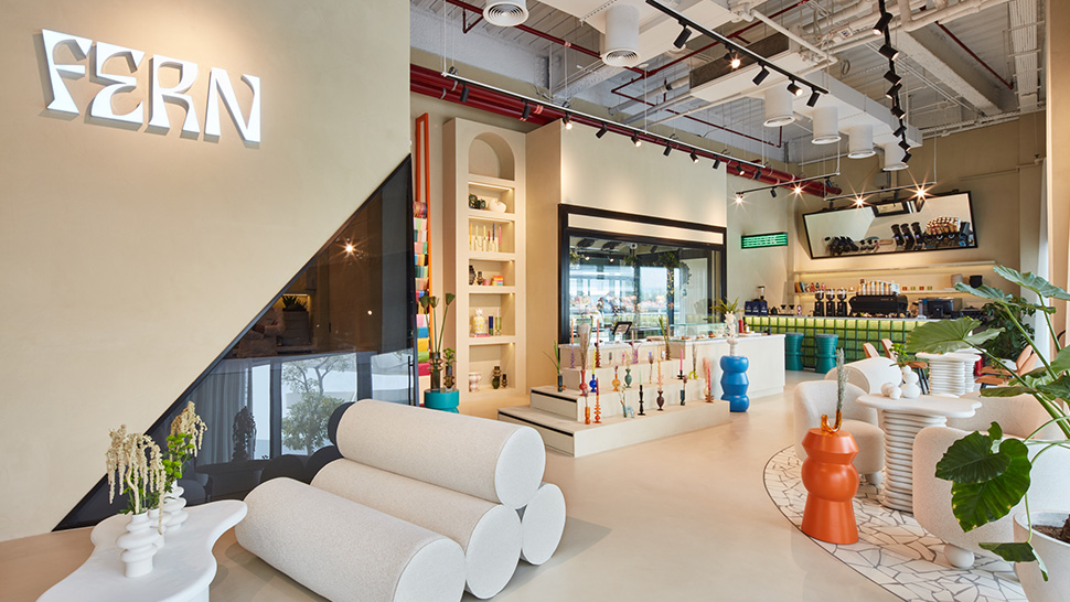
It’s a fine balance when it comes to matching colours well and colours clashing with each other. The best colour match can be achieved by looking closely at the colours you want to pair and seeing which hues and shades work together. Choosing colours with the same undertones it will help to create the right mood for the room. However, using only cool tones can make a room feel too cold, it’s beneficial to add in areas of warm undertones to offset this, and also bring in different textures to create contrast. A well balanced room should have a combination of both tones, not necessarily in equal parts.
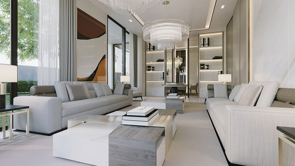
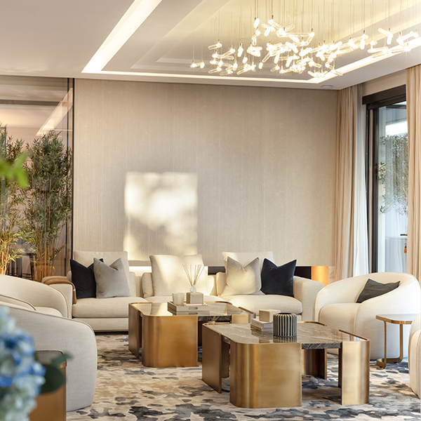
This living room project for a private residential villa has a mostly neutral palette but by using clever pops of colour in the form of bright blue feature chairs it adds character. Warmth is also brought into the space through the wall lighting fixtures and chandelier.
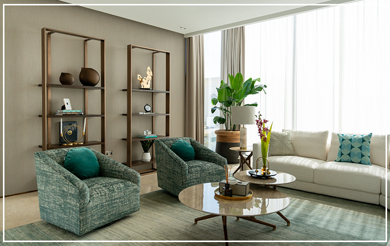
Another example of using warm toned colour to balance a cool toned grey palette, where you can see the brass metal finishes on the chairs, lighting fixture and shelving offsets the cold toned grey.
Once you understand the basics of colour matching, it can become a very valuable tool when choosing a colour scheme for your living room. While being consistent with your colour scheme can be challenging at first, the results will have a great effect on the space and ambiance of the room, it’s definitely worth taking your time to make the right decision!
If you would like to transform your space and need an expert interior designer to help you achieve this, our team of professionals would be happy to create a bespoke design for you.